Thursday, June 10, 2010

Group Vector Project

For our group Vector Project, Vanessa George and I decided to use a circle design. Each of us made three differnt sets of twenty circles, with 6 rings around each and three colors. It was very simple, and fun to put together. We added the coloague of circles, layered on top of all differnt sizes of circles. We added the three figures, Barak Obama, Che Guavaria, and Marilyn Monroe by useing the trace bitmap path operation. We took regular pictures of them and made them into silowettes. It was very fun working as a group with those two. We only had to take two classes to completle this, and the work was divided equally in between all of us. For the circles we used the duplicate and the clone tool.

Thursday, May 20, 2010

Digital Art

Throughout the digital art course I learned more experience in Photography, Photoshop, and Inkscape. I think I progressed the most in inkscape using the bezier the path operations and the text operations. It was quite hard at first to be able to get the jist of everything I was using but now I feel a lot more confidence in myself to be able to use these for birthday cards, school projects, and even projects outside of school. With photoshop I am now able to edit to photos, retouch, adjust and re-create photos just after looking at some tutorials!

Monday, May 10, 2010

Styling Text


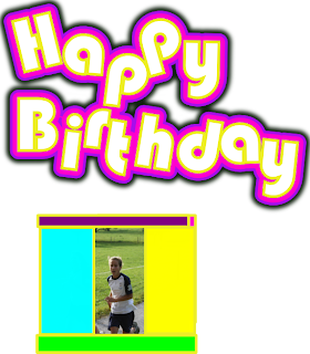
During this unit we were stylizing text to make it more bold and likable to look at. I chose 4 out of the 5 activities in the list just keeping it basic to get full results. For the first one I used the funkalicious tutorial. Very simple just using some of the path options, dynamic offset. It was very fun to colorize and use in school projects. For my next one I chose the movement of text, rotating at 90 degree, more or less angles and moving up down, left, and right. Then to add the other layers of text we yet again used another path operation called inset and outset to create more differnt effects. For the first layer we used the inset then the outset for the outer layer of text bubble. Then I tried the Neon Lights activity. That was more diffcult considering the path operations and the blur affects we needed. It was somewhat hard to get the linked offset the thinkness or thiness that we wanted. But we had to use many of the keys on our keyboard to complete it. It looked so much better on a black background. For my last activity i chose the reflection that I saw on the pixel2life.com. It was very easy, we used cloning and gradients to make it look more like the word was looking at its self in a clear misty pond. Creating text is a lot of fun because you can use it in other school projects or for birthday cards, like I did with the moving text activity.

Thursday, April 29, 2010

Inkscape Activities.


For my choice of inkscape activity i chose to work with the peacocks. I used the bezier tool quite a lot. And path operations. Mainly the bezier tool though. It was very intersting and easy to follow the instructions to complete them.

Monday, April 26, 2010

Patters on Objects Using Inkscape
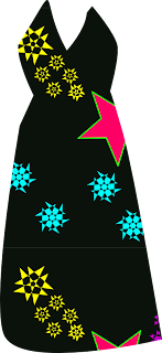


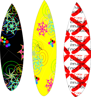
During this unit of Digital Art we were told to create patterns and put them on every day objects like Surfboards, Skis, Snowboards, articles of clothing, etc.
We would create our own pattern using just basic inkscape regular tools, then send it to pattern using the pattern operation. After that we would go to object properties and assign the pattern to the object.
the bizier tool was using in this unit to create the outside shape of whatever object we were using. We would use the diamond the square and the circle to adjust the size and direction of the pattern to make it look the best.
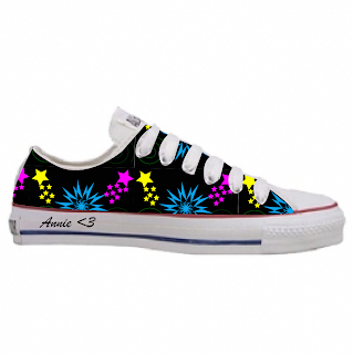
I distorted my stars to make them look more intersting and "gansta."

Monday, April 19, 2010

Photoshop Editing

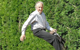
In this photo the man appears to be riding a bush, but actually I have just clone stamped the zebra he was actually riding. The clone stamp works in a way where you practicly take a bit of the background and clone it and then put it someplace else where the zebra actually was. The problem with the clone stamp tool is you have to pick the excat right area of grass or what ever substance you are editing you have to pick the right shade to make the picture look somewhat natural.

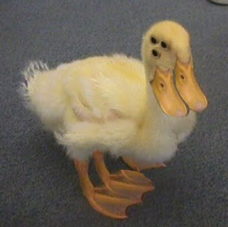
In the other picture I used the clone stamp tool to put something else into the picture. I clone stamped the part of the leg and brought it down again to make another litterally cloning the whole leg. I also cloned the eye and made two more.
This project was very fun for me because i got a laugh out of making them and then looking at them later. At times the clone stamp went too far with the opacity or too little making it look very blury and un-natural.

Thursday, March 11, 2010

Macro Lense


This week we have been working mainly with the Macro Lense of the camera. We have been having to get in closer, change our perspective, and focus was key. Without complete stillness on this photo of this chicken, the part that I wanted in focus is actually quite blury and getting out of focus, instead of in focus. Using the macro lense you are really looking for the depth of feild in a photo to be able to get a difernt perspective instead of just looking at the blue chicken, now we can look closer at the texture and depth of field. The other photo is a better example of focus, because you can really see that the red line going through the white is what is in focus. You can almost feel the texture when you look at the picture. I learned a lot about the macro lense during this unit, and also focus + depth of field.

Thursday, March 4, 2010

xPRESyOSEF


xPRESyOSEF, originally uploaded by jah~.

I just like these pictures.

58/365 - House in the sky


58/365 - House in the sky, originally uploaded by .:shk:..

The Pattern on this house is really interesting because of how the camera view is looking up the birdhouse you can see how the patterns all come together and the yellow and the pink

drip


drip, originally uploaded by KickAssCanadian_Chick.

This photo contains lines which makes it so much more interesting because if you look closely at the puddle you can see how it fell on the surface and how it is escaping from the bottle.

Misty coast


Misty coast, originally uploaded by gracious.tony.

This photo shows more texture to make the picture more interesting because when I first saw this, i felt myself running over these rocks, and looking out on the view of the scenery.

Vent de Ponent


Vent de Ponent, originally uploaded by educrevillent.

The Photographer used the rule of thirds in this picture because the tree wasent directly straight on, they changed the perspective of the shot, shooting upwatrds, and to the side.

red lady


red lady, originally uploaded by fluffster78/Claire.

The photographer showed depth in this picture because the lady beetle looks like the biggest thing that you can see right through that goes on and on.

Time Stops Breathing For a Moment (EXPLORE!)

I feel that the photographer showed great symetry and timing in this photo. The water droplets are even, and the photo is completely square, so you can see the equal parts of everything on either side.

Flickr

This is a test post from flickr, a fancy photo sharing thing.

Wednesday, March 3, 2010

Digital Photography- First Day


During our first day of digital photography we were told to follow the tips of which we learned off the HP website. Taking as many photos of the Villa, and changing the perspective was somthing I focused on. I chose differnt angles, and Differnt camera positionings. The rule of thirds came into action here, I made sure the Villa was not directly on center every time a took a picture of it.
1. Take A lot of Photos
2. Re-Frame
3. Perspective
4. Get In close.

My favourite picture I took was the one through the trees, because its almost like you are looking through the picture, I tried many times to get this picture right, re-framing, rule of thirds, and differnt perspectives.
I tried to use all the tips from the HP video that we watched.

Thursday, February 25, 2010

The elephant and the mouse.
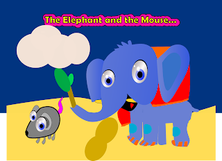

During this activity we focused mainly on the beizier. We looked at a picture of these animals and had to completley re-create them using the beizier tool, and basic shapes. Nodes were a bi part of this, too many nodes and it would look messy, too little nodes and it would be too straight or too round.
I chose the elephant because it looked more challenging. I used the path operation union quite a lot, and gradients for every part of the body to look more dark or light.
The mouse was a lot easier considering that it is smaller and has less parts to re-create.

Thursday, February 4, 2010

Animal Faces.
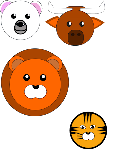
For the past two lessons we have been creating animal faces mainly with the path opeations and bizier tool.
I decided to create the polar bear, lion, tiger, and bull or longhorn, whichever one fits better. The polar bear was the easiest one to make and I used the path operation division. I used that for the mouth so it looks more realistic and the seperation is more clear. For every animal Iused align and distribute to make sure the eyes were at the same level and same distance appart. The three main path operations were Division, Union, and Differnce.

After learning more about these path operations in the lesson yesterday I was able to create more and make the animals look more advanced. The same with align and distribute you can't just have one eye and the top of the head and one eye kind of below it. So Align and Distribute to center.

Monday, February 1, 2010


Following up with the penguin, this was another one of the assignments I choose to try and re-create. This one was more difficult, one of the main things we looked into were layers. First we started with the pointy background and the gradient in that was one layer. Then we had to re-create another layer for the hearts, and flowers called the heart layer. We created these layers so things that are not meant to move don't move are get deleted with other items that might be.
Having learned how to create the heart before completling this it was easier and quicker to master. The flowers were a mesh of hearts put together in a circle to create the petals.
Again with the hearts we had to put multiple hearts in to make it look 3-d and a shine to complete it and make it look better.
We also had to turn around the hearts by double clicking and moving them around.
The background was harder we used the clone applictation from just two triangles upside down facing each other they became 15 of the smae things in a completle background, with just a square with the same gradients underneath.

Thursday, January 28, 2010

Penguin on Ice.
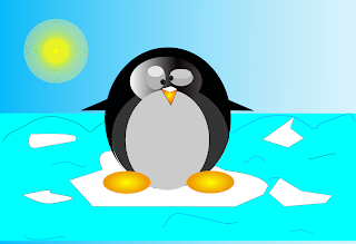


Currently we are looking deeper into the bizier tool, gradients, and nodes. Each of us had to pick at least one item to construct from the list, my choice was the penguin. I used many new path operations that I had never used before.
For this I had to the use the path operation intersection which made the one circle turn into two circlers where the grey fades into black. Gradients were also used for the feet, nose, eyes, Background and eye lids. The bizier tool was used for the arms, and the ice to make it look more realistic.
During this project I learned many new path operations and other ways to use the bizier.

Monday, January 25, 2010

Cartoon Head
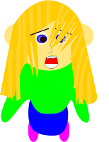

During this cartoon head design we watched a youtube video that just taught us the basic head with basic hair. After creating this I went on to change the hair to a girls hair and changed the basic mouth and nose.
I learned more about nodes especially with the hair pulling it in and out to create the fringe for the hair. Also I added more nodes in the hair to be able to make more strands of hair. We also used gradients for the eyes to make them look more realistic and have the blue change from white to blue. Gradients was also used in the Blonde to brown parts of the hair using 16 differnt stops.
We also did more work with the Bezier too to draw free hand lines or shapes. My whole mouth was created with the Bezier tool.
I learned a lot more through this creation especially while using the bezier tool and nodes..


Heart with Background


This heart was a step up from the basic heart that we created a couple of lessons ago. As shown this heart has more power, example being it looks 3-D other than flat like the other heart.
The skills that we learned during this were the duplication of the hearts to create the 3-D look. We had to duplicate the hearts and add gradient to make it look like the colors were changing in just one heart but there were actually 5 hearts in this drawing.
We learned the shine technique by using a circle and a shrunken 4 point star. All of these new techniques make the drawing look more alive and brings more character to it.


Thursday, January 21, 2010

Introduction to Inkscape- Shapes.

(Heart with Gradient.)
This is my first time taking the digital art course, and already we have learned many new concepts and things in Inkscape. Inkscape is the program we have been using to create vector graphics. We have just been having our introduction to inkscape and hearts were some of the first shapes we learned.

During the process of learning the heart we learned about the tools on the side bar as well. Nodes were some of the main things that we have to learn and keep learning about. You can make the node symmetrical and that will change how the shape is set up. From just a basic circle we were able to create a simple heart from just pulling the nodes in and out. Also I had to change how the node was set up,for the top part of my heart I had a symmetrical node, and the bottom point of my heart I had a triangular node. By changing these properties it makes the shape.

We also learned about the Bizeio tool, although we didn't use it make our hearts and four leaf clovers, but we did still learn about it. You can freely draw straight lines or circular lines with this tool. I find the nodes very confusing at times but at other times it is quite easy, all depending on the shapes and properties. I found that making the heart was not so difficult, even when we had to use the gradient inside of it. The gradient was the thing that changed the hearts colors smoothing throughout the heart as you can see in the picture as it went from blue, yellow, pink and everything in between.